
powerTemp = FileAttachment("data/power-temperature-threesites.csv").csv({ typed: true })

Inputs.table(powerTemp)Telling stories with data
James Goldie
Hi!
Climate researcher
↓
Data journalist
Storytelling fundamentals
Audience, medium and message
Audience
Do they have specialist training? (In your field, or another?)
What are their wants and worries?
Medium
Medium
Where will people encounter your work?
How long will they have to consider it?
Did they seek it out?
Message
What will your readers see first?
This is called visual hierarchy.
What did you see first on this slide? What did you see second?
Why?
When all of the elements on your plot look the same, it’s really hard for people to decide what to focus on. Without that focus, it’s difficult for your plot to lead to a conclusion. Instead, you want to vary your plot elements, drawing attention to the most important things first. There are lots of ways to do this: bolding text, making it bigger, using colours, and taking advantage of natural reading direction can all help to establish visual hierarchy.
When all of the elements on your plot look the same, it’s really hard for people to decide what to focus on.
Without that focus, it’s difficult for your plot to lead to a conclusion.
Instead, you want to vary your plot elements, drawing attention to the most important things first.
There are lots of ways to do this:
bolding text
making it bigger
using striking colours…
… or softer colours
taking advantage of natural reading direction
These techniques can all help establish visual hierarchy.
Using Quarto for storytelling
What is Quarto?
Example 1
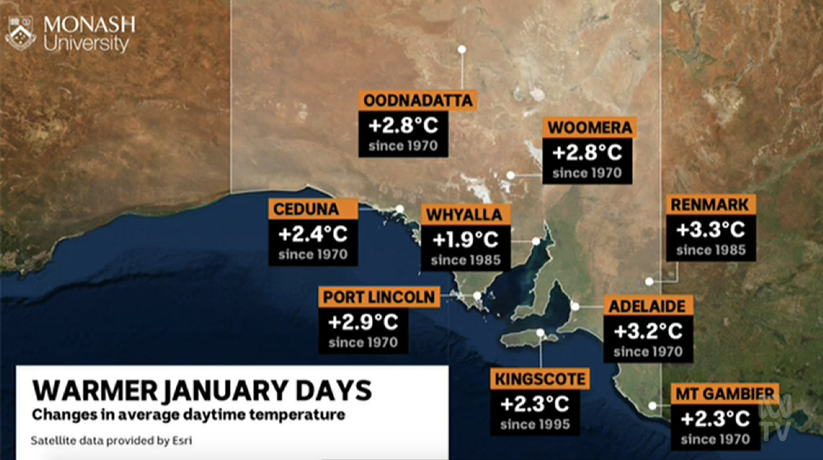
Your data is electricity demand and temperature at 3 inner Melbourne sites:
github.com/jimjam-slam/talk-storytelling-r-quarto/
blob/main/data/power-temperature-threesites.csv
A basic chart
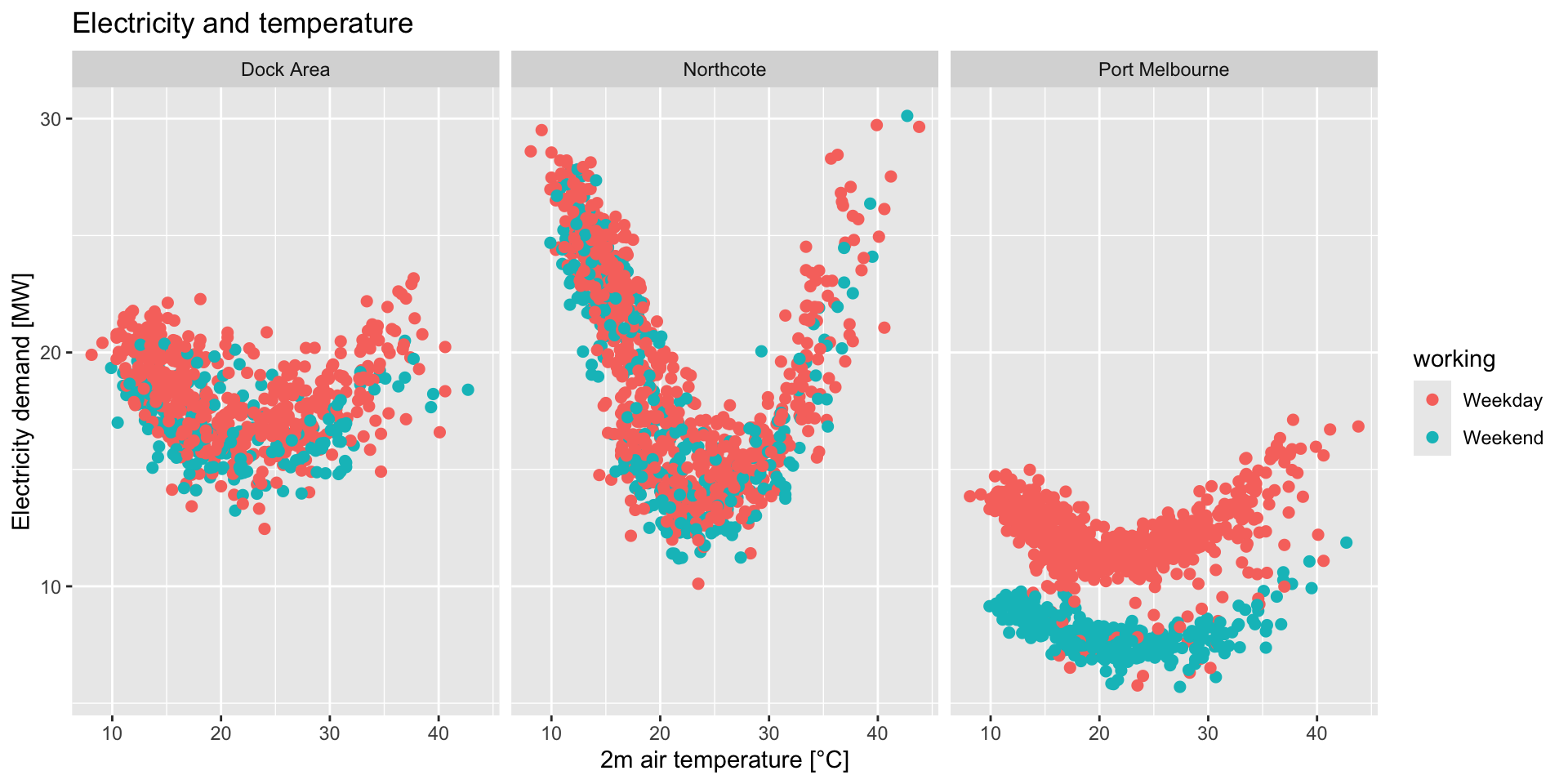
What stories could we tell with this data?
What improvements could we make?
Use Quarto to explore this data
Scrollytelling with Closeread
What’s scrollytelling?
Scrollytelling involves graphics that stick to the screen and and change as the user scrolls.
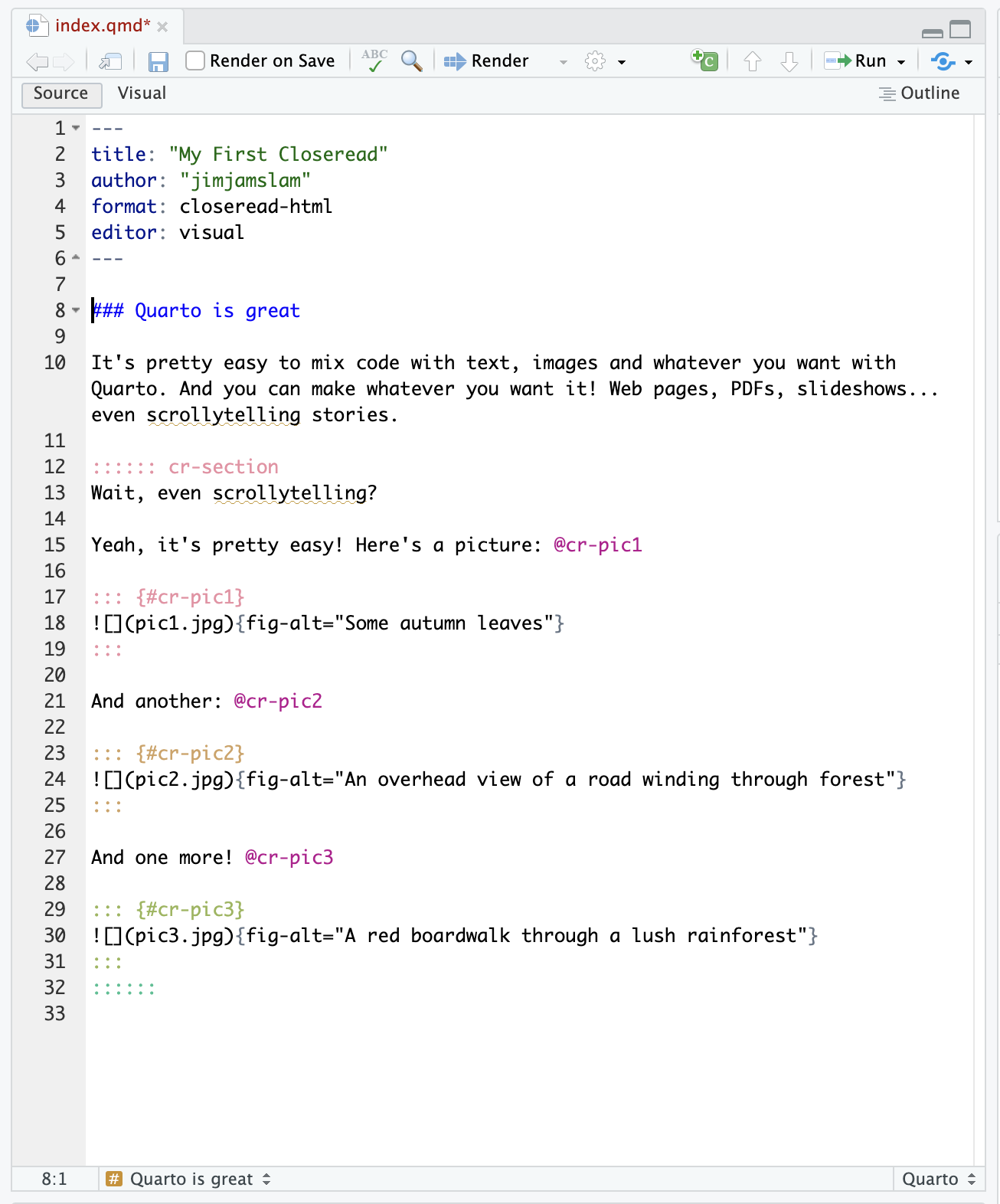
Closeread: scrollytelling with Quarto
Closeread is a Quarto extension developed by Andrew Bray
and James Goldie (me!)
(We named it after a New York Times series — the piece in the last slide was from this series!)
Closeread lets you turn a regular Quarto doc into a scrollytelling doc
How Closeread works
Step 1
A Quarto extension is like an R package — it extends Quarto’s abilities.
Install Closeread in the RStudio Terminal by running:
Step 2
At the top of your Quarto doc, change
format: html → format: closeread-html
Step 3
Tell Quarto where the scrollytelling starts and stops:
:::{.cr-section}

(scrollytelling stuff goes here!)

:::
How Closeread works
Closeread has two components: stickies and triggers.
Stickies
Things you want to stick on the screen. Give them an ID starting with #cr-.
Triggers
These make the stickies appear. They work like citations: use the ID of the sticky with an @:
When this text scrolls past, my great figure will appear! @cr-myplotHow can scrollytelling help my communication?
Here’s a Closeread example where we build a plot up one layer at a time:
closeread.dev/
gallery/demos/
build-up-plots/
How can we use this technique with our electricity and temperature data?
Wrapup
Use Closeread, win prizes
Andrew Bray (my collaborator on Closeread) and I have teamed up with data science company Posit to run the Closeread Prize.
posit.co/blog/closeread-prize-announcement
Entries close Jan 5th
(we just extended the contest!)